Our services
Your brand is more than just a logo — it's the story, emotion, and experience that surrounds your business. At Mila Bozic Studio, we help businesses craft powerful, consistent, and memorable brands that resonate with their target audience and stand out in the marketplace.
Our Branding Services Include:
1. Brand Strategy
We start with research and insights to develop a strategic foundation for your brand. This includes defining your mission, vision, values, target audience, and brand positioning to ensure every element of your brand aligns with your business goals.
2. Brand Identity Design
From your logo to color palette, typography, and imagery — we create a cohesive visual identity that reflects your brand personality and appeals to your ideal customers.
3. Logo Design
A great logo is the face of your brand. Our designers craft distinctive, scalable, and timeless logos that leave a lasting impression.
4. Brand Guidelines
To maintain brand consistency across all platforms, we provide detailed brand guidelines covering usage of logos, fonts, colors, tone of voice, and more.
5. Marketing Collateral Design
We design professional, on-brand materials such as business cards, brochures, social media templates, presentations, and packaging that reinforce your brand message.
6. Rebranding
Whether your business is evolving or you need a fresh start, we help reimagine your brand while preserving what your audience already loves.
Why Branding Matters:
Builds trust and credibility
Creates emotional connection with your audience
Differentiates you from competitors
Enhances customer loyalty
Increases perceived value
Let’s turn your business into a brand people remember and trust. Whether you're starting from scratch or looking to refresh your identity, our team brings creativity and strategy together to bring your vision to life.
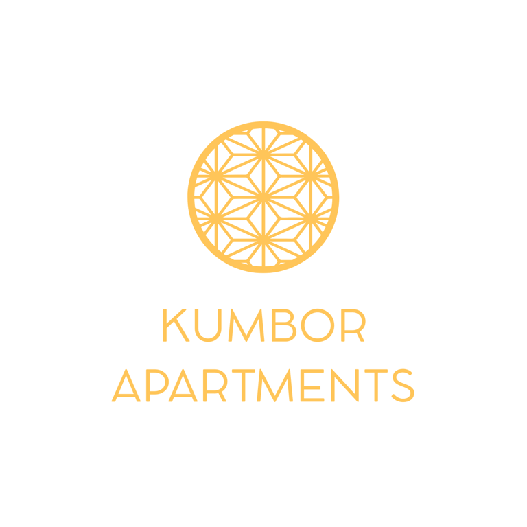
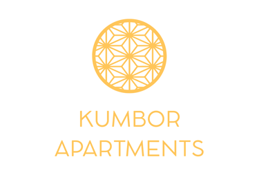
Kumbor Apartments
Kumbor Apartments Logo: Elegant geometric circular design in gold, conveying a sense of modern sophistication and quality for apartment rentals in Kumbor.
The stylish logo for Kumbor Apartments features a refined, golden geometric pattern enclosed in a circle. This design evokes a feeling of contemporary elegance, precision, and a touch of luxury, perfectly representing modern apartment living in Kumbor, Montenegro. Ideal for attracting those seeking high-quality rentals.
The logo for Kumbor Apartments in Montenegro presents a meticulously crafted golden geometric design encased within a perfect circle. This emblem speaks to a sense of refined sophistication and contemporary elegance, mirroring the high-quality living experience offered in the beautiful coastal town of Kumbor. The intricate pattern suggests attention to detail and a commitment to modern design principles, ideal for attracting discerning individuals seeking premium apartment rentals along the stunning Montenegrin coast.
The Kumbor Apartments logo utilizes a delicate yet impactful golden geometric arrangement within a circular frame, conveying a sense of harmony, precision, and inherent quality resembling stylized mimosa flower. This visually appealing design suggests a commitment to excellence and a modern approach to living in Kumbor, Montenegro. It aims to attract individuals seeking comfortable, stylish, and well-designed apartments in a desirable location.
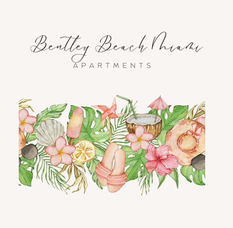
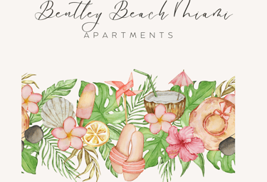
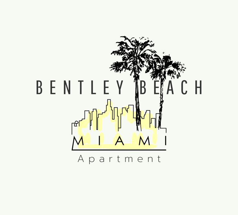
Bentley Beach Miami Apartments
This eye-catching logo for Bentley Beach Miami Apartments uses a beautiful watercolor style to depict the essence of a Miami beach getaway. Lush green tropical foliage, delicate pink hibiscus blossoms, a refreshing coconut cocktail with a straw and umbrella, elegant seashells, a popsicle, a slice of lemon, a playful pinwheel, stylish beach sandals, a sun hat, and smooth stones create a sense of upscale relaxation and coastal charm. Perfect for attracting discerning renters seeking a premium beachfront living experience in Miami.
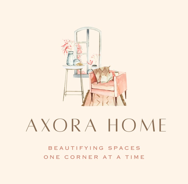
At Axora Home, our logo tells a story—one of warmth, beauty, and the quiet joy of turning a house into a home. Designed with a soft, watercolor aesthetic, the illustration features a serene interior vignette: a blush-toned armchair, a cozy throw, an open book, and a steaming cup—all lovingly arranged next to a side table and sunlit window.
Every detail in this scene captures the heart of our mission: “Beautifying spaces, one corner at a time.” The delicate florals on the windowsill, the natural light pouring in, and the calm palette all evoke a space that’s been thoughtfully curated, where comfort meets elegance in every detail.
Our brand name, AXORA HOME, is displayed in a refined serif font—modern, minimal, and sophisticated—conveying our commitment to timeless style and design. Beneath it, our tagline is presented in soft terracotta lettering, reinforcing our belief that beauty begins with small, intentional touches.
This logo embodies our core values:
– Intentional Living
– Thoughtful Design
– Affordable Elegance
– Inspired Interiors
Whether you're refreshing a reading nook, styling a shelf, or reimagining an entire room, Axora Home is here to help you create a space that feels beautifully yours.
Axora Home Logo
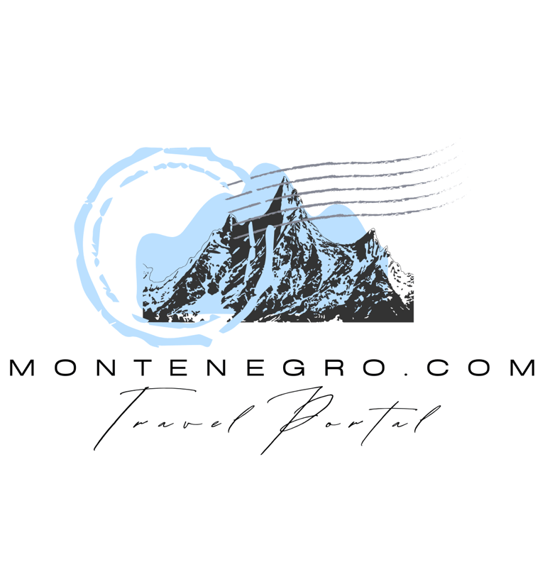
Montenegro.com Travel Portal Logo
Mountain Illustration:
Central to the logo is a stylized drawing of mountain peaks, suggesting Montenegro’s rugged and scenic terrain—perhaps referencing the famous Durmitor or Prokletije mountain ranges.
The color palette includes shades of light blue and dark gray/black, reflecting the natural beauty and contrast between sky and stone.
Circular Postmark & Wavy Lines:
A circular stamp mark and wavy lines, reminiscent of a postal stamp or travel passport stamp, evoke the feeling of travel and exploration.
These elements enhance the idea of the portal being a gateway for travel and discovery.
Typography:
"MONTENEGRO.COM" is written in a clean, modern sans-serif font—professional and easy to read.
"Travel Portal" is in a script, handwritten-style font, giving it a personal, inviting, and elegant touch.
Brand Identity & Message:
The logo communicates:
Adventure and Nature: through the rugged mountains.
Authentic Travel Experiences: with the postmark and handwritten elements.
Professionalism and Clarity: via the clean typography and layout.
It’s perfect for a tourism website or travel agency aiming to promote Montenegro as a destination full of natural wonders, adventure, and cultural richness.
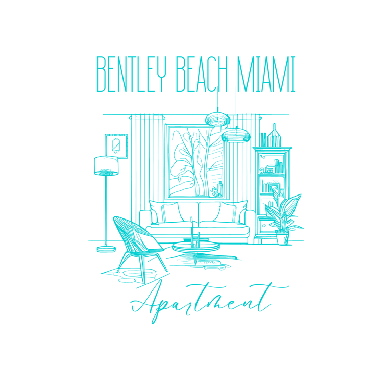
Beach Apartment Logo
Name & Typography
"Bentley Beach Miami" is written in a tall, sleek sans-serif font that feels modern and upscale, suggesting a luxurious, beachfront lifestyle.
"Apartment" is written in a flowing, cursive script, adding a personal, welcoming touch that contrasts beautifully with the structured title above.
Visual Illustration
The central artwork features a hand-drawn style sketch of a stylish living room:
A comfy sofa with cushions is framed by curtains and a large piece of wall art, suggesting a well-decorated interior.
Accents like pendant lamps, a floor lamp, coffee table, bookshelf, indoor plants, and a lounge chair give it a cozy and curated feel.
The large window hints at a view — possibly the beach or Miami skyline — enhancing the image of a serene, luxurious apartment stay.
Color Scheme
The entire design uses a clean, monochromatic turquoise blue tone. This color evokes the ocean, tranquility, and clarity—perfectly in line with a beachfront Miami location.
Brand Identity
The logo successfully communicates:
Luxury with warmth: a perfect blend of elegance and comfort.
Coastal living: through both color and theme.
A boutique or premium rental experience: not just a place to stay, but a lifestyle to enjoy.
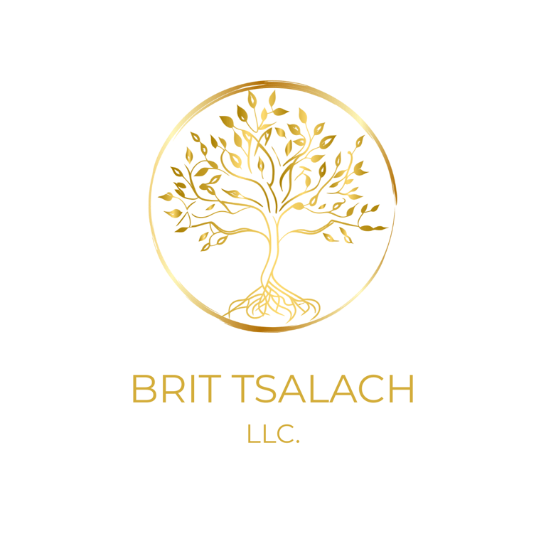
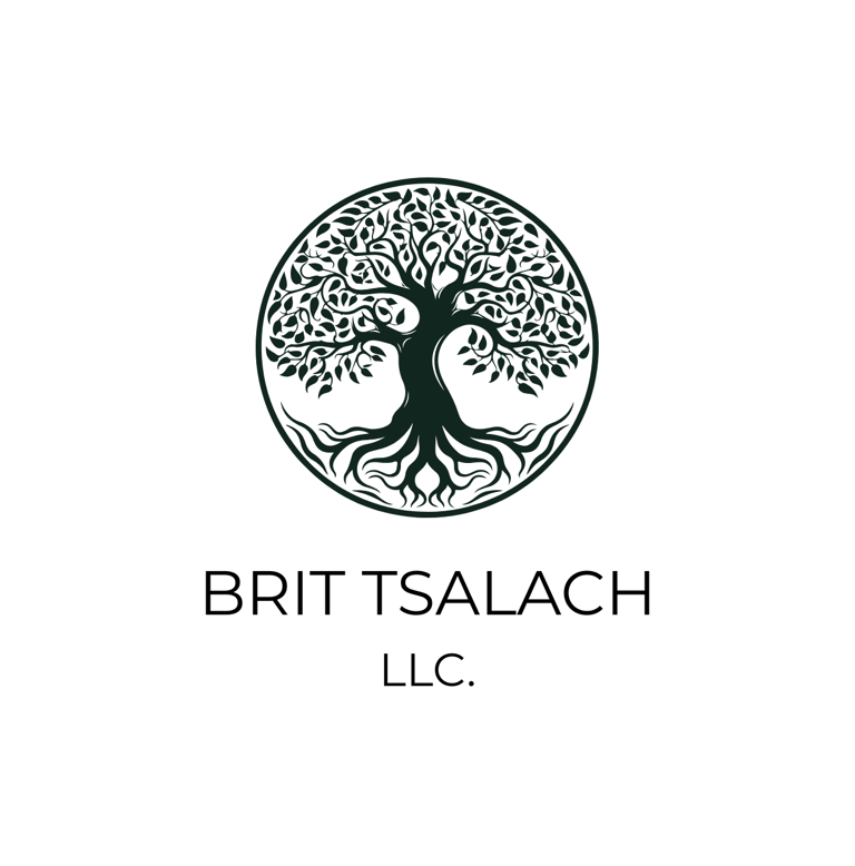
The logo for BRIT TSALACH LLC. is elegant, symbolic, and thoughtfully designed. Here's a detailed breakdown:
Visual Elements:
Tree of Life Symbol:
The centerpiece is a stylized golden tree with detailed branches and leaves, enclosed in a thin, golden circular border.
The tree has visible roots, emphasizing grounding, growth, and stability.
This “Tree of Life” style symbolizes life, wisdom, strength, and connection, often associated with spiritual or holistic themes.
Color Palette:
The use of metallic gold gives a sense of luxury, prestige, and timelessness.
The background is clean white, which emphasizes the logo’s elegance and clarity.
Typography:
The company name, "BRIT TSALACH", is written in an all-uppercase, modern sans-serif font beneath the tree.
Below it, “LLC.” appears in a slightly smaller size, maintaining symmetry and a clean finish.
The gold font complements the tree graphic, ensuring visual harmony.
Interpretation:
“Brit” is a Hebrew word often meaning "covenant" or "pact".
“Tsalach” is derived from Hebrew meaning “to prosper” or “succeed”.
Together, Brit Tsalach could suggest something like “Covenant of Prosperity” or “Path to Success through Covenant,” which aligns well with the tree imagery symbolizing fruitful growth and deep roots.
Possible Uses:
This logo could be ideal for a company in fields such as:
Holistic wellness
Coaching or consulting
Faith-based initiatives
Educational or spiritual development services
Personal development or leadership training
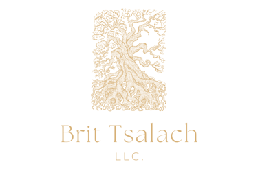
Brit Tsalach Llc.
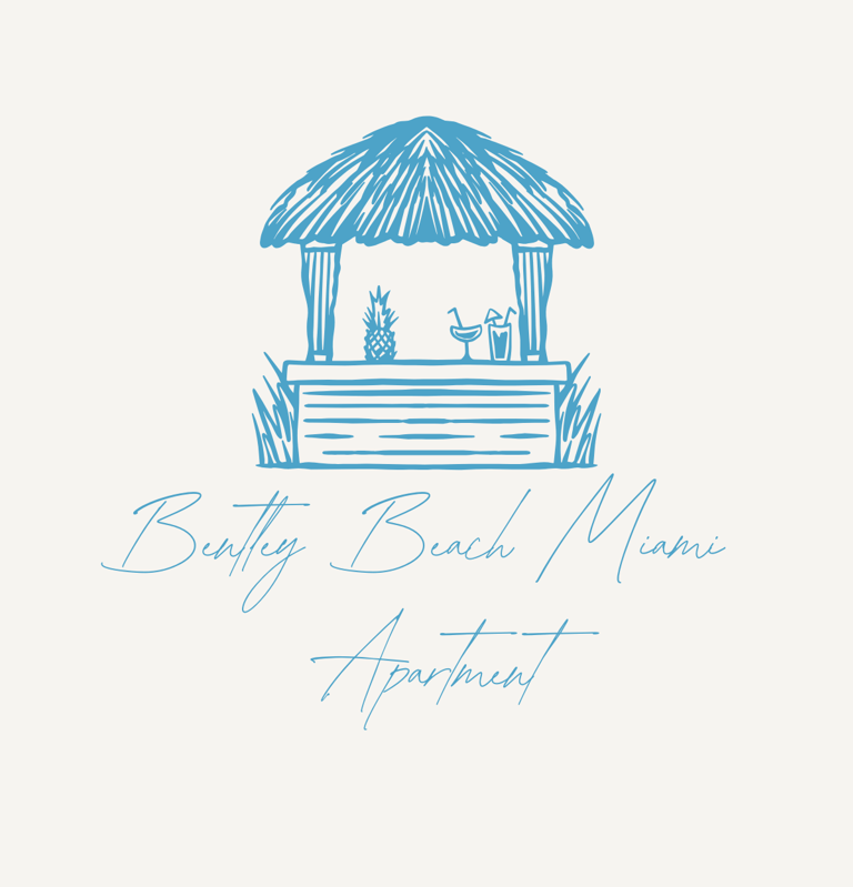
Bentley Beach Miami Logo
The logo for Bentley Beach Miami Apartment is a charming and stylish visual that beautifully captures the essence of a relaxing beachside getaway.
Design Elements:
Tiki Bar Illustration:
At the top of the logo is a hand-drawn-style tiki bar with a thatched roof, two pillars, and a countertop adorned with a pineapple and two tropical cocktails.
This imagery evokes a sense of vacation, tropical leisure, and coastal lifestyle, immediately suggesting a beachfront location where relaxation is key.
Typography:
The text “Bentley Beach Miami” is written in a delicate, elegant script font that conveys sophistication and a touch of luxury.
The word “Apartment” is also written in the same script, but placed underneath with a slightly larger spacing to emphasize the nature of the property.
Color Palette:
The entire logo is rendered in a calm, light blue shade, enhancing the coastal, serene, and ocean-inspired vibe.
The choice of blue also communicates trust, peace, and comfort—ideal for a hospitality or vacation rental brand.
Overall Impression:
This logo does an excellent job of visually telling the story of a beach apartment in Miami. It feels inviting, laid-back yet upscale, perfect for attracting guests looking for a luxurious escape in a tropical paradise.
Would you like help turning this into branding materials (like business cards, social media banners, etc.) or need versions in different formats?
Brit Tsalach LLC. Logo
The logo for BRIT TSALACH LLC. is a beautifully crafted design that carries a strong sense of symbolism and professionalism.
Visual Elements:
Tree of Life Symbol:
The central image is a stylized Tree of Life enclosed within a perfect circle.
The tree features intricate, intertwining branches and abundant leaves, symbolizing growth, strength, stability, and interconnectedness.
Its prominent roots reaching deep into the ground reflect foundation, heritage, and grounded values, reinforcing a holistic representation of life, wisdom, and continuity.
Typography:
The name "BRIT TSALACH" is written in clean, modern uppercase letters, suggesting clarity, professionalism, and confidence.
The abbreviation "LLC." underneath is subtly emphasized, denoting its formal structure as a Limited Liability Company.
Color Palette:
The use of deep, natural tones (likely dark green or black) adds a sense of elegance and timelessness, while also connecting to themes of nature, growth, and stability.
Symbolic Meaning:
The name "Brit Tsalach" (possibly Hebrew in origin) may translate to something meaningful like “Covenant of Prosperity” or “Prosperous Alliance,” aligning well with the themes of growth and purpose represented by the tree.
The circular form suggests wholeness, unity, and eternity, enhancing the spiritual and business-oriented identity of the company.
Overall Impression:
This logo gives a strong, grounded, and sophisticated impression. It would be well-suited for organizations focused on wellness, holistic services, consultancy, education, or even faith-based initiatives—anything where purpose, growth, and integrity are central.
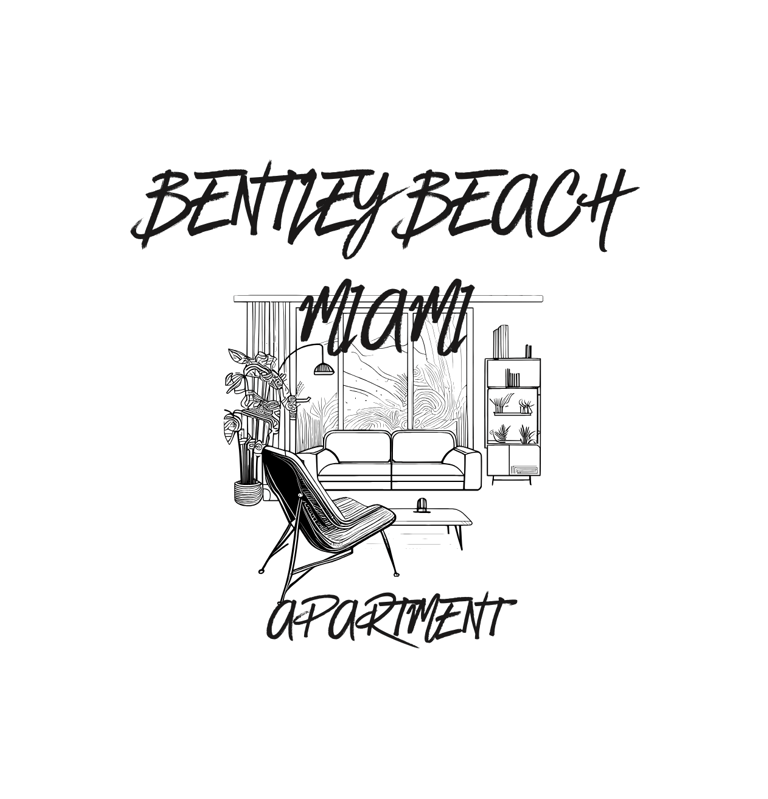
This logo represents a brand or property named "Bentley Beach Miami Apartment." The design and typography suggest a modern, stylish, and possibly luxurious living space, likely catering to a beachside or coastal lifestyle in Miami.
Design Breakdown:
Typography:
The fonts are handwritten-style, giving off a relaxed yet upscale and trendy vibe.
"BENTLEY BEACH" and "APARTMENT" are in all caps, emphasizing boldness and brand strength.
"MIAMI" stands out in the center, connecting the location to the aesthetic of the apartment.
Illustration:
The image in the background features a cozy, stylish interior with a lounge chair, sofa, coffee table, lamp, indoor plants, and a bookshelf.
The window shows palm trees swaying, evoking a tropical, beachy Miami atmosphere.
The whole composition creates a sense of relaxation, comfort, and elegant vacation-style living.
Purpose and Appeal:
This logo would work great for a short-term rental, Airbnb listing, vacation apartment, or a real estate brand focusing on high-end or lifestyle-centric beachfront properties.
The mix of tropical and modern aesthetics caters to travelers looking for a luxurious stay with a local, homey feel.
Beach Apartment for Rent
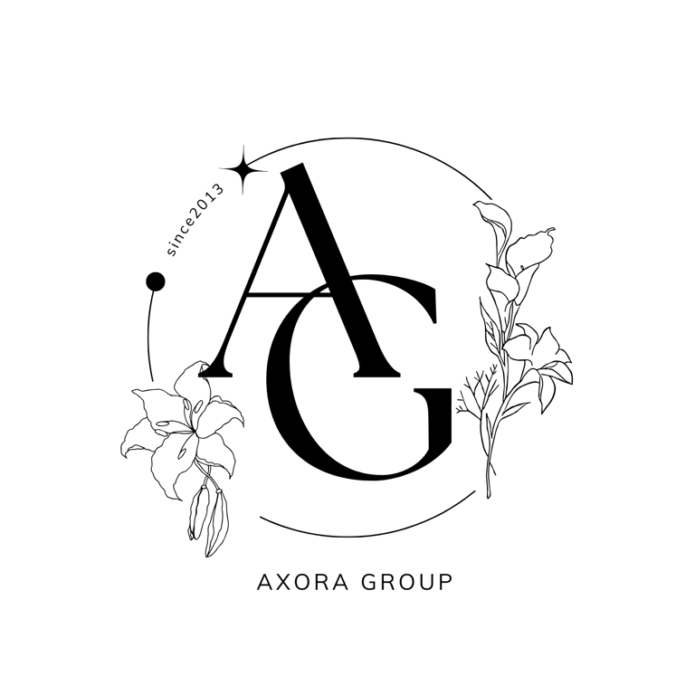
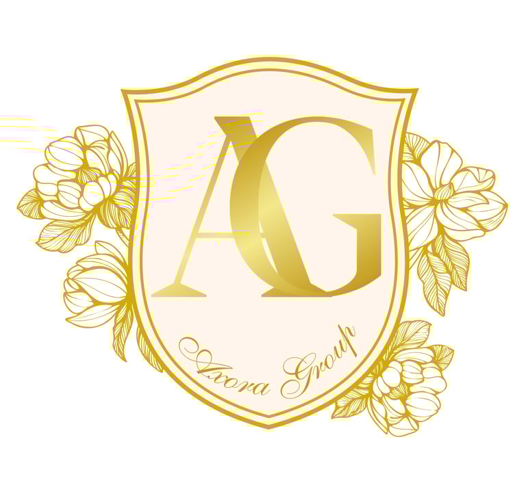
Axora Group Logo
Introducing the Axora Group Logo, an exquisite emblem designed to elevate your brand's identity. This logo blends a sleek, modern 'AG' monogram with elegant floral accents, creating a perfect balance of sophistication and minimalism. Ideal for any branding purpose, it captures a refined aesthetic that will make a lasting impression. Customizable in various sizes and colors to match your brand's unique style.
BentlyBeach Miami Logo
The Bently Beach Miami logo embodies a serene and luxurious beachfront lifestyle with its elegant, hand-drawn design. Featuring a picturesque beach scene, the logo includes two palm trees, a thatched umbrella, and two lounge chairs facing the tranquil ocean, symbolizing relaxation and tropical bliss. The sun shining above adds a warm, inviting touch, evoking the beauty of a coastal retreat.
The typography blends modern elegance with a handwritten script, giving the logo a sophisticated yet approachable feel. The earthy, monochromatic color palette enhances the timeless and refined aesthetic, making it perfect for a high-end beachfront brand.
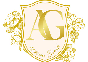
Elegant Emblem with Floral Design Logo
Luxury 'AG' Emblem – Elegant Branding & Decorative Design
Elevate your brand or space with our sophisticated and elegant 'AG' emblem, designed for both branding and decorative purposes. This meticulously crafted emblem features the initials 'AG' elegantly centered within a shield outline, symbolizing prestige and strength. The shield is adorned with intricate gold floral designs, adding a touch of luxury and sophistication. Whether for business branding, office décor, or personal collections, this timeless emblem is a statement of high-quality craftsmanship and refined aesthetics. Enhance your presence with this exquisite emblem today!
Lifestyle-Enhancing Design
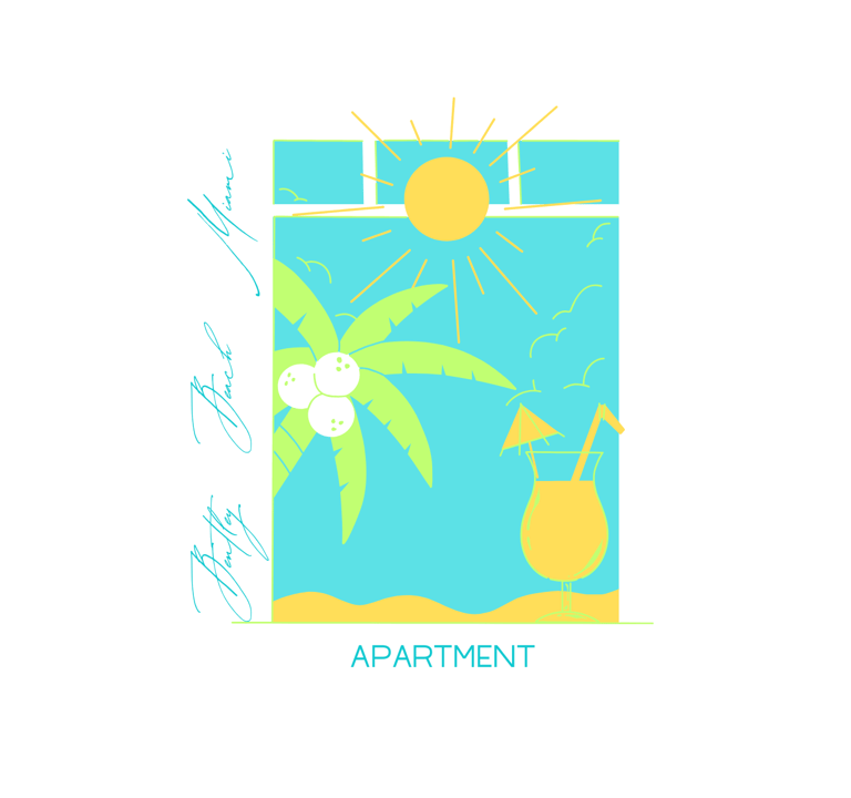
This logo represents "Bentley Beach Miami Apartment" and features a tropical beach theme. The design includes a bright sun, a palm tree with coconuts, a refreshing tropical drink with an umbrella and straw, and a clear blue sky with seagulls, evoking a luxurious, vacation-like atmosphere. The color palette consists of bright yellow, green, and blue, symbolizing sunshine, nature, and the ocean. The typography is elegant and stylish, with "Bentley Beach Miami" written in a cursive, script-like font on the left side, while "APARTMENT" is displayed in a modern, clean font at the bottom. This logo effectively conveys a high-end beachfront living experience, likely targeting vacationers or residents looking for a luxury stay in Miami.
Collaborative Design Services
The logo for "AXORA DESIGN" features a striking and distinctive geometric pattern placed above the company name. Here's a breakdown of its elements and overall impression:
The Pattern:
Art Deco Influence: The pattern strongly evokes the Art Deco style, a popular design movement from the 1920s and 1930s. Key characteristics include:
Geometric Shapes: The design is built upon repeating fan-like or shell-like shapes arranged in a grid.
Symmetry: The individual elements and the overall arrangement appear symmetrical, contributing to a sense of order and elegance.
Stylized Natural Forms: The fan shape can be interpreted as a stylized representation of natural elements like peacock feathers or stylized sunbursts, common motifs in Art Deco.
Bold Contrast: The use of contrasting colors (black and white or a dark and light tone) enhances the visual impact and sharpness of the geometric forms.
Repetitive and Scalable: The pattern appears to be designed for repetition, suggesting it could be used as a seamless background, textile print, or applied across various branding materials at different scales.
The Text:
"AXORA DESIGN": The company name is presented in a clean, sans-serif typeface. This choice of font complements the geometric nature of the pattern, offering a modern and straightforward contrast to the more decorative element above.
Placement: The name is positioned directly beneath the geometric pattern, grounding the logo and clearly identifying the brand.
Simplicity: The text is simple and unadorned, allowing the more visually complex pattern to take center stage.
Overall Impression:
Stylish and Sophisticated: The Art Deco-inspired pattern conveys a sense of style, sophistication, and timeless elegance. It suggests a design aesthetic that is both classic and visually appealing.
Modern Yet Retro: The logo strikes a balance between a vintage feel (due to the Art Deco influence) and a modern sensibility (thanks to the clean font and bold graphic).
Memorable and Distinctive: The unique geometric pattern makes the logo instantly recognizable and helps "AXORA DESIGN" stand out.
Versatile: The combination of a strong graphic element and a clear company name makes the logo versatile for various applications, from business cards and websites to product packaging and physical spaces.
In conclusion, the "AXORA DESIGN" logo is a well-executed piece that effectively utilizes an Art Deco-inspired geometric pattern to create a stylish, memorable, and versatile brand identity. The contrast between the decorative pattern and the clean typography enhances its visual appeal and communicates a sense of sophisticated design.
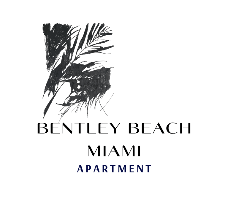
Complete Architecture Services
The Bentley Beach Miami Apartment logo presents a sophisticated and minimalistic design. Here’s an analysis of its key elements:
Design & Aesthetic
The logo features a black ink-style illustration of palm leaves, giving it a natural and artistic feel. This design aligns with Miami’s tropical, beachside atmosphere.
The monochrome color scheme (black and white) adds a touch of elegance and luxury, making it appealing to a high-end audience.
Typography & Branding
The brand name "Bentley Beach" is written in a clean, modern serif typeface, which conveys a sense of exclusivity and sophistication.
"Miami" is placed beneath in a sleek, sans-serif font, reinforcing the location while maintaining a contemporary look.
The word "Apartment" is styled in a smaller, uppercase font, slightly bolder and in deep navy or black, which subtly highlights the property type without overshadowing the main brand name.
Brand Messaging
This logo effectively communicates a luxurious, beachfront living experience in Miami.
The use of nature-inspired elements and refined typography suggests an upscale yet relaxing lifestyle, ideal for a high-end residential or vacation rental property.
Miami Beach Logo
The logo features a stylized design suggesting a luxurious apartment complex in Miami Beach. Here's a breakdown of its elements:
"BENTLEY BEACH": This is the prominent text at the top, suggesting the name of the apartment complex. The use of a clean, sans-serif font conveys a sense of modernity and sophistication, aligning with the luxury car brand "Bentley," possibly implying a high-end experience.
Palm Trees: Two silhouetted palm trees are centrally positioned, immediately evoking a tropical, beachside location. This is a classic symbol associated with Miami and coastal living.
Miami Skyline: Below the palm trees, a simplified outline of a city skyline is visible, further reinforcing the "Miami" association. The skyline is not overly detailed, maintaining a clean and somewhat abstract aesthetic.
"MIAMI": This word is placed below the skyline, in a slightly larger and bolder font than "Apartment," emphasizing the location.
"Apartment": This word appears in a smaller, lighter font beneath "MIAMI," clearly defining the nature of the offering.
Overall Impression:
The logo creates a feeling of upscale coastal living. The combination of "Bentley Beach" with the Miami imagery (palm trees and skyline) suggests a premium residential experience in a desirable location. The clean lines and simple design contribute to a modern and elegant aesthetic.
Possible Interpretations:
The name "Bentley Beach" might be directly inspired by the luxury car brand, aiming to associate the apartments with the same level of prestige and quality.
The logo effectively communicates the key selling points: luxury, beach access, and the vibrant city of Miami.
The design is versatile and could be used across various branding materials, both online and offline.
In summary, the logo is a well-designed representation of a high-end apartment complex in Miami Beach, effectively using text and imagery to convey its brand identity.
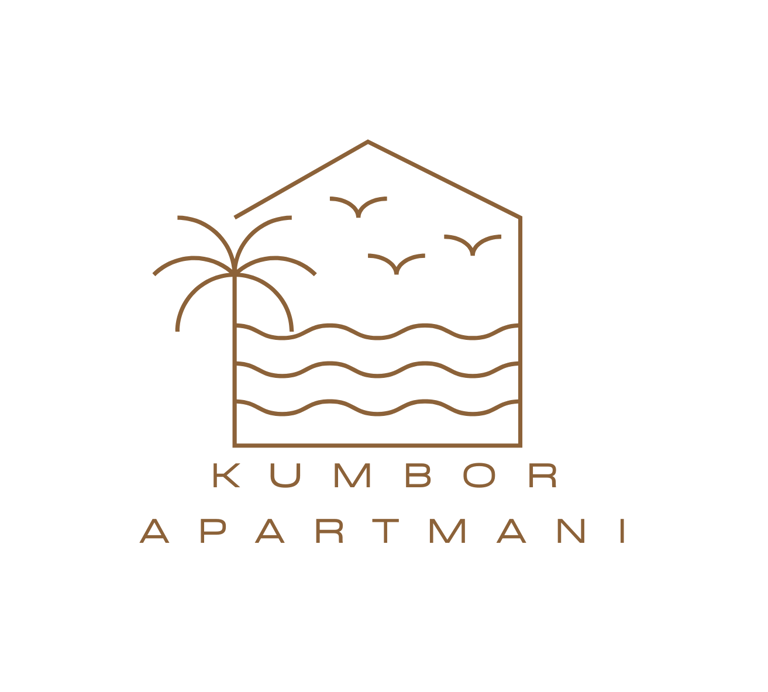
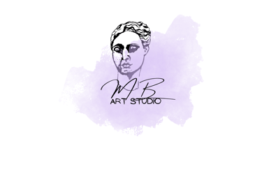
Kumbor Apartments Logo
The logo for "KUMBOR APARTMANI" is a clean and minimalist design that effectively communicates the essence of seaside apartment rentals. Here's a breakdown of its elements:
Outline of a House/Building: The central element is a simple, single-line outline of a building or house. This immediately signifies accommodation or property.
Coastal Elements Within the Outline: Inside the house outline, several elements suggest a coastal or seaside location:
Wavy Lines: Horizontal wavy lines represent the sea or water.
Palm Tree: A stylized palm tree is depicted on one side, a classic symbol of coastal and often tropical or Mediterranean locations.
Birds in Flight: Three simple, curved lines suggest birds flying overhead, further reinforcing an outdoor and possibly scenic environment.
Color Palette: The logo uses a single color, a warm brown or gold tone, against a light background. This creates a sophisticated and understated feel. The monochromatic palette contributes to the minimalist aesthetic.
Typography: The text "KUMBOR" and "APARTMANI" is placed below the graphic. The font appears to be a clean, sans-serif typeface, likely in a slightly condensed style. "KUMBOR" is in a larger font size and centered, indicating it's the primary name (likely the location or the name of the property). "APARTMANI" is smaller and placed below, clearly stating the type of accommodation offered.
Overall Impression:
Clean and Minimalist: The use of simple lines and a single color creates a modern and uncluttered feel.
Evokes Seaside Location: The palm tree, waves, and birds clearly communicate that these apartments are located by the sea.
Sophisticated and Understated: The warm brown/gold color and clean lines suggest a level of quality and refined taste.
Direct and Informative: The inclusion of "APARTMANI" makes it immediately clear what the business offers.
Memorable and Versatile: The simplicity of the design makes it easily recognizable and adaptable for various branding materials.
Possible Interpretations:
The logo emphasizes a relaxed and natural environment associated with coastal living.
It suggests a comfortable and accessible type of accommodation (apartments) in the Kumbor area (Dobrota, Kotor Municipality, Montenegro, as per the context).
The design avoids being overly literal, opting for a more symbolic and elegant representation.
In conclusion, the "KUMBOR APARTMANI" logo is a well-designed piece that effectively uses minimalist illustration and clean typography to convey its core message of seaside apartment rentals in a sophisticated and memorable way.
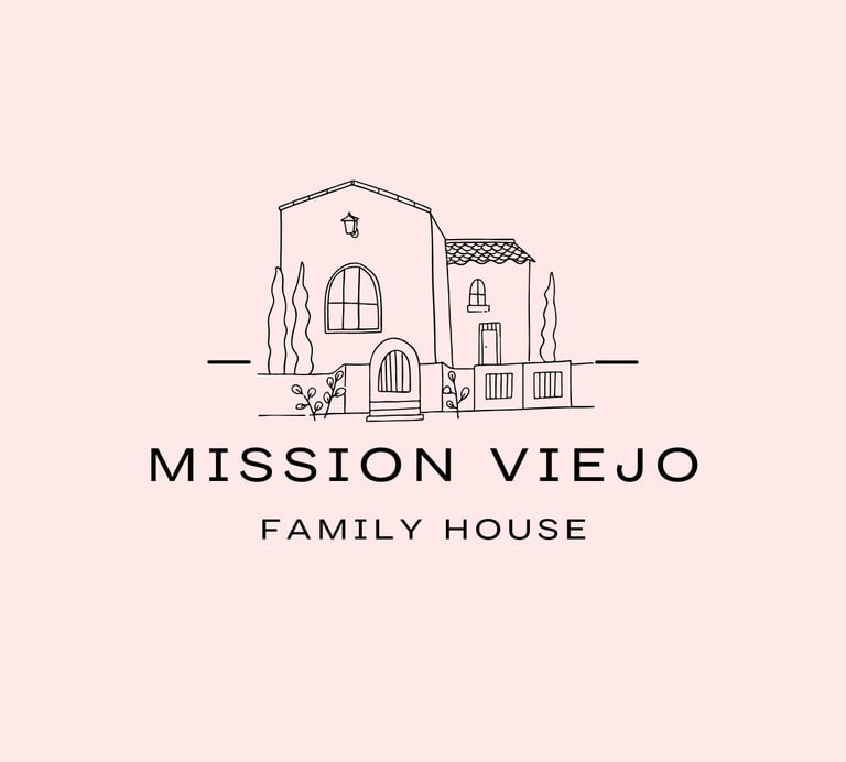
The logo for "MISSION VIEJO FAMILY HOUSE" presents a charming and inviting image, clearly aimed at conveying a sense of home and family. Here's a breakdown of its elements:
Hand-Drawn Illustration of a House: The central element is a simple, slightly whimsical, hand-drawn illustration of a house. This style evokes a feeling of warmth, personal touch, and approachability. Key features of the house illustration include:
Two-Story Structure: Suggesting a family-sized dwelling.
Arched Window: A prominent arched window adds a touch of architectural detail and character.
Pitched Roof with Tiles: Indicating a traditional house structure.
Front Door with Details: A visible front door with steps, implying welcome and entry.
Smaller Window on the Second Story: Adds visual interest and balance.
Stylized Landscaping: Simple representations of trees or bushes on either side of the house further enhance the domestic feel.
Ground Line: A simple horizontal line grounds the illustration.
Typography: The text elements are placed below the house illustration:
"MISSION VIEJO": This is the most prominent text, likely the name of the location or the specific house being represented. It's in a clean, slightly bold sans-serif typeface, conveying clarity and stability.
"FAMILY HOUSE": Placed below "MISSION VIEJO" in a smaller, lighter sans-serif font. This clearly defines the nature of the property.
Color Palette: The logo uses a limited color palette. The illustration and text are in a dark color (likely black or a dark gray) against a soft, light pink or beige background. This combination creates a gentle and inviting aesthetic. The soft background color adds to the feeling of warmth and comfort.
Overall Impression:
Warm and Inviting: The hand-drawn style and soft color palette create a welcoming and approachable feel, strongly suggesting a family-oriented space.
Personal and Homey: The slightly imperfect lines of the illustration contribute to a sense of personal touch and a non-corporate, homey atmosphere.
Clear and Understandable: The combination of the house illustration and the text "FAMILY HOUSE" clearly communicates the nature of what is being represented.
Location Specific: The inclusion of "MISSION VIEJO" clearly identifies the geographical context.
Simple and Memorable: The uncluttered design and distinct illustration make the logo easy to remember.
Possible Interpretations:
This logo could be used for a real estate agency specializing in family homes in Mission Viejo.
It could represent a specific family home being offered for rent or sale.
It might be the branding for a family-oriented business or service located in Mission Viejo.
In conclusion, the "MISSION VIEJO FAMILY HOUSE" logo is a well-designed representation that effectively uses a charming illustration and clear typography to convey a sense of warmth, family, and a specific location. The overall aesthetic is inviting and memorable.
Family House for Rent Logo
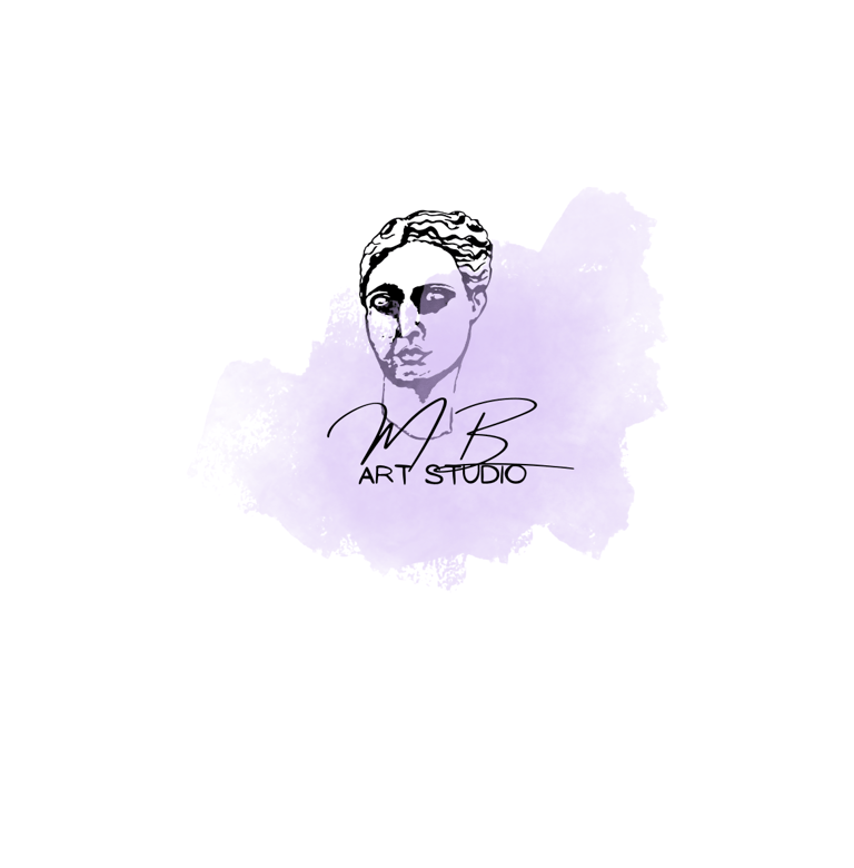
Art Studio Logo
The logo for "MB ART STUDIO" presents a creative and artistic feel, blending classical elements with a modern touch. Here's a breakdown of its components:
Classical Bust Illustration: The most prominent element is a stylized, somewhat abstract line drawing of a classical bust or head. The features are simplified but recognizable, suggesting a connection to traditional art, sculpture, or perhaps a focus on portraiture or figurative art. The slightly unfinished or sketch-like quality adds to the artistic feel.
Abstract Watercolor Splash: Behind the bust and the text, there's a soft, abstract watercolor splash in shades of light purple or lavender. This adds a touch of organic texture, color, and visual interest without overpowering the main elements. The watercolor effect often evokes creativity, fluidity, and artistic expression.
Signature-Style Initials: Overlapping the watercolor splash and partially obscuring the bust, are the large, flowing script initials "MB." This suggests a personal touch, likely representing the artist or founder of the studio. The signature style reinforces the individual and creative nature of the art studio.
"ART STUDIO" Text: Below the initials, the words "ART STUDIO" are written in a smaller, clean, sans-serif typeface. This clearly identifies the nature of the business. The contrast in font styles between the script initials and the sans-serif text creates a visual hierarchy and balance.
Overall Impression:
Artistic and Creative: The combination of the classical bust, watercolor splash, and signature-style initials strongly conveys an artistic and creative environment.
Personal and Unique: The prominent initials suggest a personal touch and a unique artistic vision associated with the studio.
Blend of Traditional and Modern: The classical bust hints at traditional art forms, while the watercolor splash and clean "ART STUDIO" text offer a contemporary feel.
Sophisticated and Elegant: The muted color palette and the flowing script of the initials contribute to a sense of sophistication and elegance.
Intriguing and Evocative: The slightly abstract nature of the bust and the watercolor splash create an intriguing visual that invites curiosity about the art studio.
Possible Interpretations:
The studio might specialize in classical art techniques or draw inspiration from historical art.
It could offer a range of artistic services, with a personal and expressive approach emphasized by the signature initials.
The watercolor element might suggest a focus on painting or other fluid art forms.
In conclusion, the "MB ART STUDIO" logo is a thoughtfully designed visual that effectively communicates its artistic nature through a blend of classical imagery, abstract textures, and personalized typography. It creates a sophisticated and intriguing impression, hinting at a unique and creative artistic space.
The logo for "KUMBOR APARTMENTS" uses a bright and cheerful color palette and simplified shapes to convey a sense of a relaxed, coastal getaway. Here's a breakdown of its elements:
Stylized Coastal Scene: The central image is a layered composition of basic geometric shapes representing a coastal environment:
Buildings: Two simplified house or building outlines are visible, one in a light blue and partially overlapping another in light green. They have minimal details, suggesting basic structures.
Palm Trees: Two stylized palm trees are placed in front of the buildings. One is larger and in light blue, while the other is smaller and in light green, creating a sense of depth.
Waves: Three horizontal wavy lines in a slightly darker shade of blue are positioned at the bottom, clearly representing water or the sea.
Color Palette: The logo utilizes a vibrant and summery color scheme:
Light Blue: Used for one building outline, the larger palm tree, and the text. This color often evokes feelings of the sky and the sea.
Light Green: Used for the other building outline and the smaller palm tree, suggesting nature, freshness, and possibly lush vegetation.
Slightly Darker Blue: Used for the wavy lines, providing contrast and clearly defining the water element.
White Background: The bright white background enhances the vibrancy of the colors.
Typography: The text "KUMBOR APARTMENTS" is placed below the graphic. It uses a clean, sans-serif typeface in the same light blue color as some of the graphic elements. The letters are slightly spaced out, contributing to a modern and airy feel.
Overall Impression:
Bright and Cheerful: The vibrant color palette immediately creates a positive and welcoming impression, suggesting a pleasant vacation destination.
Coastal Focus: The prominent imagery of palm trees and waves clearly communicates a location near the sea.
Simplified and Modern: The use of basic shapes and clean lines gives the logo a modern and uncluttered aesthetic.
Suggests Accommodation: The stylized building outlines indicate the availability of apartments or lodging.
Relaxed and Inviting: The overall feel is one of ease and relaxation, appealing to those seeking a beachside getaway.
Possible Interpretations:
The logo directly represents apartment rentals in Kumbor, Montenegro, a location known for its coastline.
The overlapping colors and shapes might suggest a blend of nature and built environment.
The simplicity of the design makes it easily recognizable and memorable.
In conclusion, this "KUMBOR APARTMENTS" logo effectively uses bright colors and simplified coastal imagery to create a cheerful and inviting brand identity that clearly communicates its offering and location. The modern and clean design is well-suited for attracting tourists and vacationers seeking a seaside stay.
Kumbor Apartments Logo
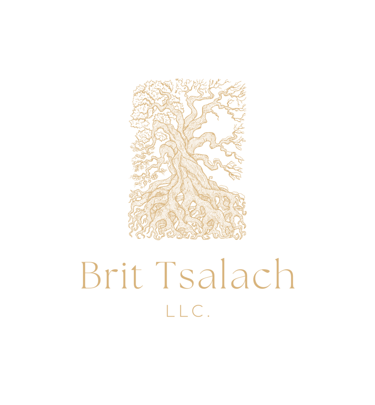
The Brit Tsalach LLC logo presents a refined and meaningful design centered around a majestic, intricately drawn tree. This tree, with its elaborate, curling branches and deeply entwined roots, serves as a powerful visual metaphor for legacy, growth, resilience, and spiritual grounding. Its natural form exudes both strength and fluidity, echoing themes of life, continuity, and connection to the earth.
The tree is artistically rendered in a warm, golden beige tone—suggestive of wisdom, enlightenment, and prosperity—creating a sense of organic elegance and timelessness. Every detail in the bark, leaves, and roots is finely illustrated, giving the impression of handcrafted, artisanal care. The rectangular frame encasing the tree subtly grounds the composition, symbolizing structure and stability, while still allowing the tree’s branches to reach freely—reflecting a balance between foundation and expansion.
Beneath the tree, the company name “Brit Tsalach” is displayed in a graceful, serif typeface. The font choice conveys professionalism, tradition, and calm authority. The soft golden hue of the text complements the tree illustration, reinforcing unity across the brand’s visual identity. The name is followed by “L.L.C.” in clean, minimalist capitals, affirming the business's legitimacy and structured presence.
Set against a crisp white background, the logo achieves a minimalist yet rich aesthetic—clean, calming, and sophisticated. The design is versatile, ideal for digital and print use across a variety of sectors including holistic wellness, faith-based organizations, consulting firms, environmental services, or legacy-focused enterprises.